UX LENS
News and Tips

User Onboarding Flows
The User Onboarding Flows means introducing users to your product and services through well designed onboarding flows. Through the crux is the user should be awed by the first impression and make it into a long lasting relationship with the product.
It’s easier said than done. To do this, the app/website onboarding flows should have intricacies that need to be followed to make the user experience great. But before going through in depth into this. Let us understand,
What is the purpose of User Onboarding Flows?
The user onboarding flow needs to be in flow in the website to have less bounce rate, great user engagement and loyalty. A disjointed or confusing onboarding process can lead to higher bounce rates and low user retention. Users today have limited patience; if they can’t figure out how to use your product quickly, they’ll likely look for alternatives.
Let us look into some examples regarding the smooth flow of the user
LinkedIn is a social network with 740+ million users in 200 countries. The LinkedIn focuses on consistent and progressive user onboarding flows across platforms which means users can access the LinkedIn in computer, mobile and tab without any issues.
So let’s start from Beginning, After the app is downloaded there is a welcome message ““Make the most of your professional life.” That gives the user the gist of the application and guides the user in a set of steps for making a relevant profile.
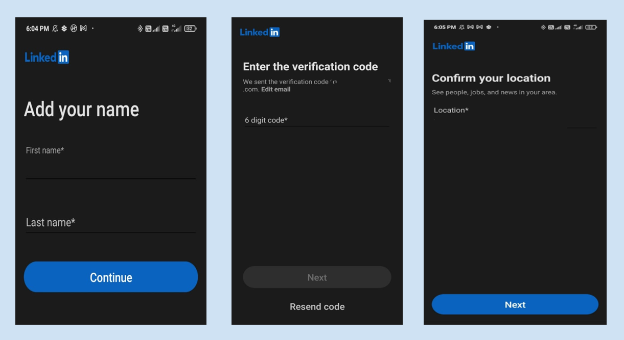
The user is then onboarded through 4 different stages:
1) Complete user personal information
2) Receive email confirmation
3) Follow Thought Leaders and join LinkedIn groups for better exposure
4) Add into your people network and get suggestions for any new connections.
After the user setup is completed then it takes to the main section for the user to use.
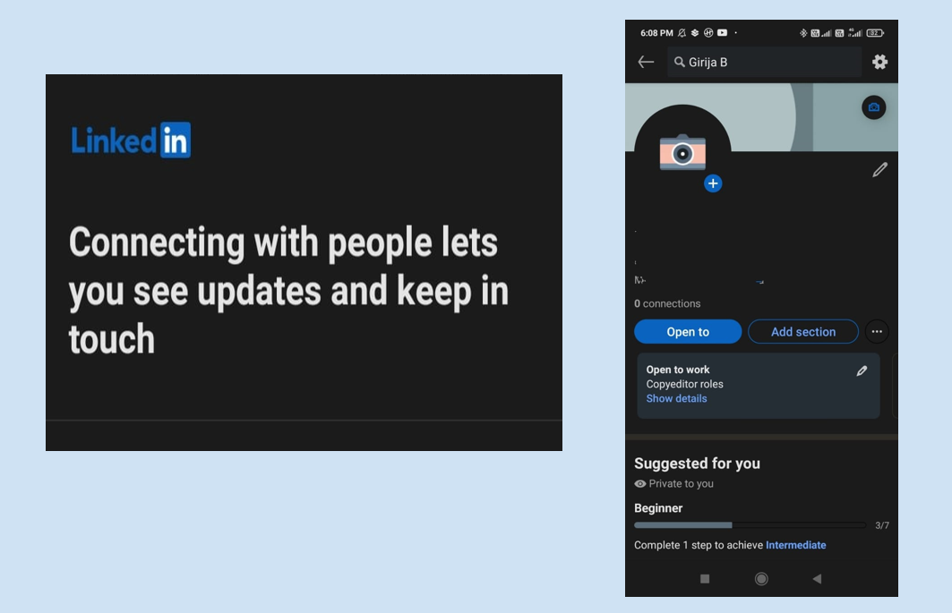
Instagram is a photo sharing application that uses FOMO to trigger for the users to motivate them to join at the earliest. Instagram uses pre-filled onboarding fields from Facebook for easy registration for seamless user integration experience.
SoundCloud:
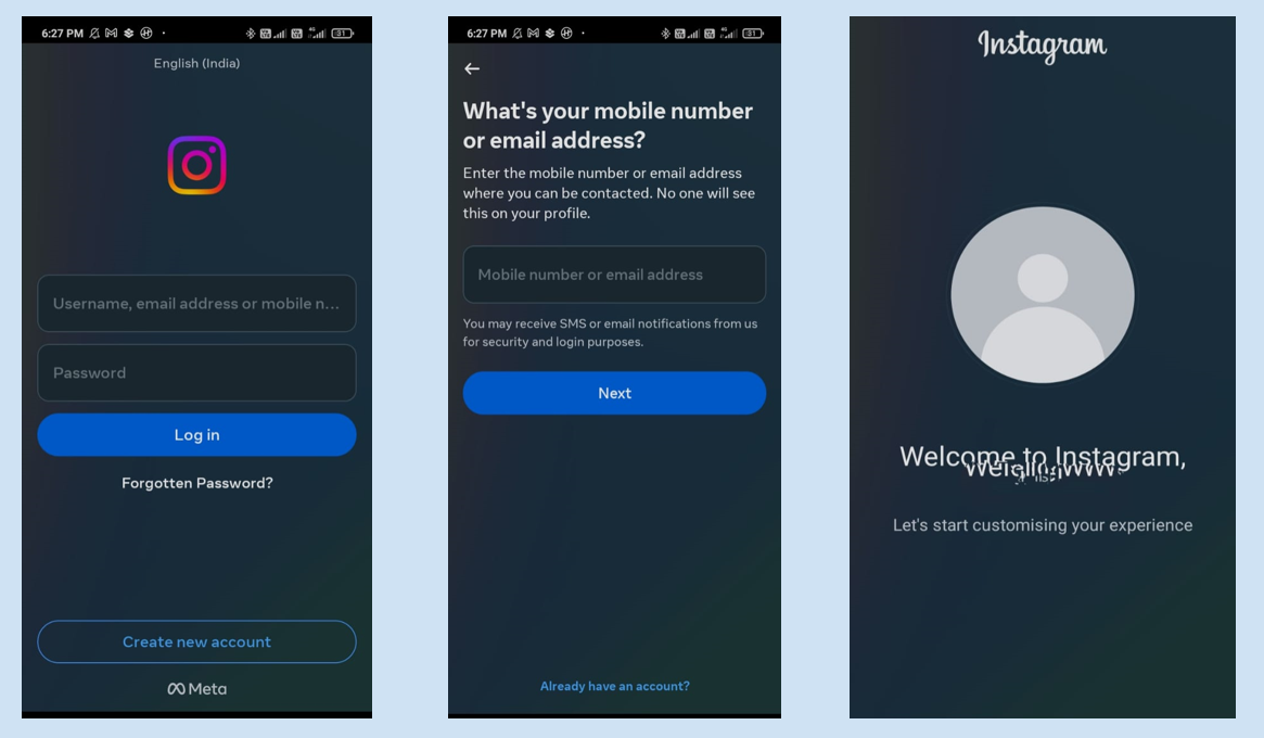
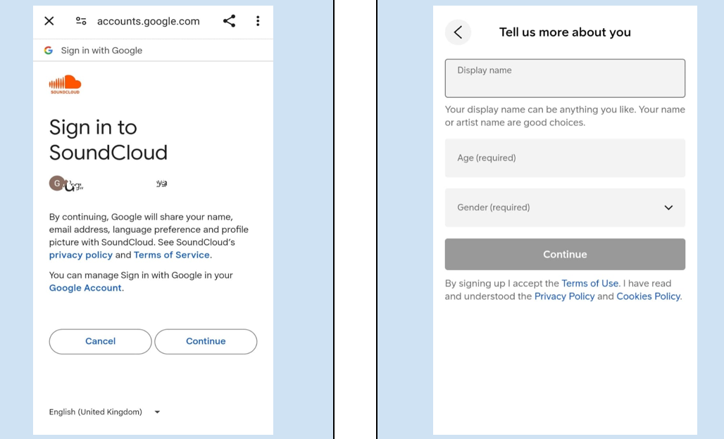
Soundcloud is a digital platform dedicated to streaming and distributing audio content, enabling users to upload, stream, market, and exchange music and podcasts. It uses Google, Facebook, Apple and Email for signup.
In the image, you can see the email is mentioned in small letters and less highlighted because of less conversion. This can be checked with funnels that help in understanding the user behaviour
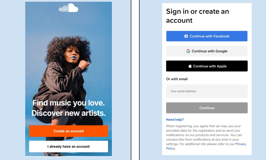
After accepting the terms and conditions, sign up through your existing account. Next step is to give your age, name and gender and after that you will be redirected to the main page.
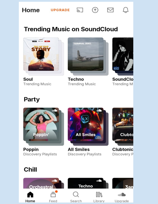
The asks for the consent to track the location and then you will get the personalised main page. One of their strong USP is their UX design is user friendly that makes the user onboarding experience impressive.
What are the key components of an effective Onboarding Flow?
1. Welcome Message: When the user opens the application, he/she should view the value of this product which itself sets a positive tone right from the beginning.
2. Collect the necessary information: While registration collects only the relevant data. Don’t try to smother the user with unnecessary data such as permission for usage of email id or mobile number for promotional. Let the registration be swift for user to experience the app.
3. Clear call to action: The user should have clear actions that helps in smooth flow functionality in the website/mobile.
4. Feedback Mechanisms: Provide feedback features in your application that demonstrate you value user input.
5. Track your onboarding fuels that help in tracking user’s dropouts from your app/website
6. While registration give the user a microscopic guide to help them in ongoing issues. For example, during login, share some hints/tips to increase the success of registration.
What are the common Onboarding mistakes?
1. Information Overload: Don’t overwhelm users with too much information all at once. Keep the onboarding process concise and focused on the essentials.
2. Lack of Personalisation: Tailor the onboarding experience to each user’s needs and preferences whenever possible. Get personalised recommendations and guidance that can significantly enhance user engagement.
3. Ignoring Mobile Users: With more users accessing products from mobile devices, it’s crucial to optimise your onboarding flow for mobile platforms to ensure a smooth experience across all devices.
4. Failing to Iterate: User onboarding is an ongoing process that should be continuously evaluated and refined based on user feedback and analytics data. Don’t be afraid to experiment with different approaches and iterate based on what works best for your users.
Conclusion
A well-designed user onboarding flow is essential for driving user engagement, retention, and ultimately, the success of your product. By understanding the needs and preferences of your users and carefully crafting a seamless onboarding experience, you can set your product apart and turn new users into loyal advocates.
Placement of the week

Suman Samanta - BFA
White Swan Labs- UI DESIGNER
If you are into Art and familiar with aesthetics, philosophy and technical aspects of design, exploring UIUX design can introduce you to the human-centered side of design. The UX part was particularly valuable. Teaching us how to behave, speak and present in front of recruiters is incredible.
Accessibility Audit Tools
Responsive Design Practices
User Onboarding Flows
The User Onboarding Flows means introducing users to your product and services through well designed onboarding flows. Through the crux is the user should be awed by the first impression and make it into a long lasting relationship with the product.
It’s easier said than done. To do this, the app/website onboarding flows should have intricacies that need to be followed to make the user experience great. But before going through in depth into this. Let us understand,
What is the purpose of User Onboarding Flows?
The user onboarding flow needs to be in flow in the website to have less bounce rate, great user engagement and loyalty. A disjointed or confusing onboarding process can lead to higher bounce rates and low user retention. Users today have limited patience; if they can’t figure out how to use your product quickly, they’ll likely look for alternatives.
Let us look into some examples regarding the smooth flow of the user
LinkedIn is a social network with 740+ million users in 200 countries. The LinkedIn focuses on consistent and progressive user onboarding flows across platforms which means users can access the LinkedIn in computer, mobile and tab without any issues.
So let’s start from Beginning, After the app is downloaded there is a welcome message ““Make the most of your professional life.” That gives the user the gist of the application and guides the user in a set of steps for making a relevant profile.

The user is then onboarded through 4 different stages:
1) Complete user personal information
2) Receive email confirmation
3) Follow Thought Leaders and join LinkedIn groups for better exposure
4) Add into your people network and get suggestions for any new connections.
After the user setup is completed then it takes to the main section for the user to use.

Instagram is a photo sharing application that uses FOMO to trigger for the users to motivate them to join at the earliest. Instagram uses pre-filled onboarding fields from Facebook for easy registration for seamless user integration experience.

SoundCloud:
Soundcloud is a digital platform dedicated to streaming and distributing audio content, enabling users to upload, stream, market, and exchange music and podcasts. It uses Google, Facebook, Apple and Email for signup.
In the image, you can see the email is mentioned in small letters and less highlighted because of less conversion. This can be checked with funnels that help in understanding the user behaviour

After accepting the terms and conditions, sign up through your existing account. Next step is to give your age, name and gender and after that you will be redirected to the main page.

The asks for the consent to track the location and then you will get the personalised main page. One of their strong USP is their UX design is user friendly that makes the user onboarding experience impressive.

What are the key components of an effective Onboarding Flow?
1. Welcome Message: When the user opens the application, he/she should view the value of this product which itself sets a positive tone right from the beginning.
2. Collect the necessary information: While registration collects only the relevant data. Don’t try to smother the user with unnecessary data such as permission for usage of email id or mobile number for promotional. Let the registration be swift for user to experience the app.
3. Clear call to action: The user should have clear actions that helps in smooth flow functionality in the website/mobile.
4. Feedback Mechanisms: Provide feedback features in your application that demonstrate you value user input.
5. Track your onboarding fuels that help in tracking user’s dropouts from your app/website
6. While registration give the user a microscopic guide to help them in ongoing issues. For example, during login, share some hints/tips to increase the success of registration.
What are the common Onboarding mistakes?
1. Information Overload: Don’t overwhelm users with too much information all at once. Keep the onboarding process concise and focused on the essentials.
2. Lack of Personalisation: Tailor the onboarding experience to each user’s needs and preferences whenever possible. Get personalised recommendations and guidance that can significantly enhance user engagement.
3. Ignoring Mobile Users: With more users accessing products from mobile devices, it’s crucial to optimise your onboarding flow for mobile platforms to ensure a smooth experience across all devices.
4. Failing to Iterate: User onboarding is an ongoing process that should be continuously evaluated and refined based on user feedback and analytics data. Don’t be afraid to experiment with different approaches and iterate based on what works best for your users.
Conclusion
A well-designed user onboarding flow is essential for driving user engagement, retention, and ultimately, the success of your product. By understanding the needs and preferences of your users and carefully crafting a seamless onboarding experience, you can set your product apart and turn new users into loyal advocates.
Accessibility Audit Tools
Placement of the week

Suman Samanta - BFA
White Swan Labs- UI DESIGNER
If you are into Art and familiar with aesthetics, philosophy and technical aspects of design, exploring UIUX design can introduce you to the human-centered side of design. The UX part was particularly valuable. Teaching us how to behave, speak and present in front of recruiters is incredible.
