UX LENS
News and Tips

Design Systems for Large Organizations
Design Systems for Large Organizations, with their sprawling product landscapes and far-flung teams, can often resemble a tangled web when it comes to digital experiences.This is where the design system becomes a powerful tool that acts as a single source of truth for design and development. The design system consists of a comprehensive library of reusable components, design patterns, coding standards, and brand guidelines that ensure a cohesive and efficient digital experience across all products.
You must be wondering, What is the design system? How is this different from other basic designs?
So, let’s delve more deeply into this..
What is a Design System?
A design system is a collection of design rules and ready-to-use elements that help designers make choices.Its purpose is threefold: to promote consistency, efficiency, and brand cohesion. Here are some key points:
- Consistency: Design systems keep the look of different products or platforms the same. They offer a set of common parts that save time and work, making it faster to find a good solution to a problem.
- Efficiency: A robust design system streamlines the design process. Designers and developers can leverage common components and patterns, speeding up their work. It’s like having a toolkit that everyone in the organisation can use.
- Brand Cohesion: Design systems set rules for a unified brand look. This makes online products and websites easy to remember and identify..
- Guiding Principles: Effective design systems are built on shared guidelines. Some overarching principles include:
- Cohesion: Components and patterns should work well together, creating unified user experiences.
- Scalability: Design systems should scale as the organisation grows.
- Collaboration: They foster collaboration between designers, developers, and other stakeholders.
- Tools: There are various tools for building and maintaining design systems. Some popular ones include Figma, Sketch, and InVision.
What are the companies building unique design systems?
Design Systems for Large Organizations play a crucial role in maintaining consistency and transparency across product interfaces. Here are some notable companies with unique design systems:
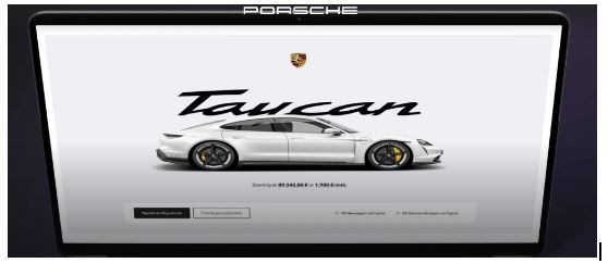
Let’s break down the Porsche design system key aspects:
- Building Blocks: Just like Lego bricks, PDS provides pre-designed and pre-coded components. These building blocks include buttons, forms, navigation elements, and more. Designers and developers can assemble them to create consistent user interfaces.
- Clear Manual: The “manual” in this analogy corresponds to the guidelines and documentation within PDS. It explains how to use each component, ensuring consistency across projects. Think of it as the instruction booklet for assembling your Lego creation.
- Frameworks Support: PDS’s compatibility with popular frameworks (React, Angular, Vue) is akin to Lego pieces fitting together seamlessly. It allows teams to work efficiently regardless of their preferred technology stack.
- Reusable Components: Just as Lego bricks can be reused in various structures, PDS components are reusable. This reduces redundancy and accelerates development.
- Streamlined Workflow: By avoiding reinvention, PDS saves time and effort. Teams don’t need to create custom solutions for common design patterns—they can rely on the standardised components.
- Quality and Aesthetics: PDS maintains high standards for quality, performance, and aesthetics. It ensures that all digital products adhere to the same level of excellence.
- Collective Optimization: PDS unifies the organisation’s design efforts. Teams collaborate to enhance the system, collectively optimising it over time.
Google Material Design System:
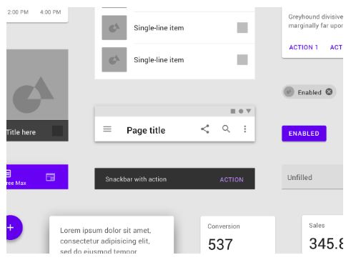
Google’s Material Design system offers several benefits that make it a popular choice for designers and developers. Let’s explore some of these advantages:
- Improved UI/UX: Material Design offers smooth animations and adaptable interfaces. It’s user-friendly and interesting, making the experience better.
- Skeuomorphic Design Features: Material Design uses light skeuomorphism, unlike flat design. It connects digital screens with real objects, making them feel more familiar.
- Responsive Layout: Material Design adapts seamlessly to various screen sizes, ensuring consistency across devices whether desktop, tablet, or mobile.
- Self-Contained UI Components: Google’s Material Design ecosystem includes a comprehensive set of rules for handling complex design situations. Designers benefit from a structured framework that covers a wide range of use cases.
- Built-in User Feedback: Material Design integrates haptic feedback, subtle animations, and other user-friendly features directly into its guidelines. These enhance usability and provide a delightful interaction experience.
- Flexibility: Material Design allows designers to create intentional designs with hierarchy, meaning, and focus. It goes beyond aesthetics, emphasising purposeful choices in the end result.
Uber Design System:
Let’s explore the features of Uber’s design system:
- Base Design System: The Base design system sets the basic rules for user interfaces in all Uber products and services. It unites Uber’s various experiences into one framework. It offers repeatable components, instructions, and design tokens for uniform and easy-to-use applications.
- Layout Grid: Uber’s layout grid ensures a consistent structure and hierarchy across various platforms and marketing materials. Based on a 4-12 column system, it allows flexible and responsive layouts that adapt to different screen sizes and devices.
- Architecture Evolution: Uber’s system structure has changed over the years. It started with Python and SQLAlchemy for the ORM, but after 2014, it shifted to a setup with many services.
- Mobile Architecture: Uber’s new mobile architecture emphasises clear organisation and separation of business logic, view logic, data flow, and routing. This approach simplifies testability, increases engineering productivity, and enhances user reliability.
- Design Tokens and Consistency: A design system like Uber’s includes design tokens—visual design information (colours, spacing, etc.).These tokens enable consistent and accessible application development across the organisation.
Shopify Design System:
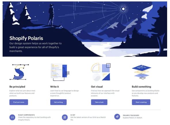
Polaris offers a comprehensive set of guidelines, reusable components, and design tokens to create consistent and delightful experiences for Shopify merchants. Let’s explore the features of Shopify’s design system, known as Polaris:
- Foundations: Polaris provides fundamental design guidance for creating quality admin experiences within Shopify. It covers aspects like layout, spacing, and accessibility.
- Components: Reusable elements and styles are packaged through code for building admin interfaces.These elements consist of buttons, menus, forms, and various other user interface components.
- Tokens: Polaris uses coded names to represent design decisions. These tokens cover colour, spacing, typography, and more. They ensure consistency and maintainable design choices across the system.
- Icons: Over 400 carefully designed icons focused on commerce and entrepreneurship are available in Polaris. These icons enhance the visual language of Shopify’s admin interfaces
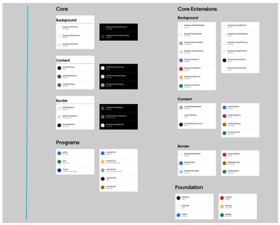
IBM Carbon Design System:
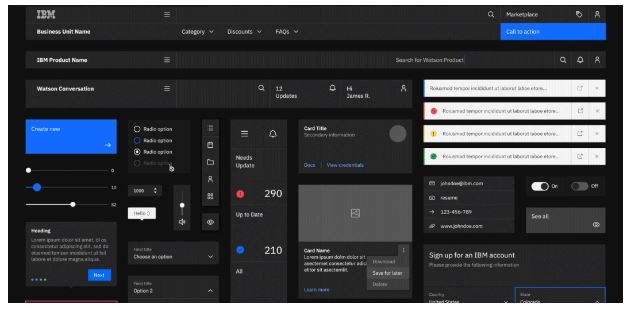
The IBM Carbon Design System is an open-source design system for products and digital experiences. It provides a comprehensive set of visual, user experience, and code guidelines and standards specifically tailored for the IBM Cloud platform and its more than 120 services. Here are some key features:
- Visual Design Kits: Carbon offers Sketch components for reuse, streamlining the design process. These kits ensure consistency across IBM Cloud products.
- User Experience Guidelines: The Carbon Design System website provides detailed guidelines, redlines, and interaction examples. This helps individual products within the portfolio maintain a cohesive look and feel.
- Front-End Code Kit: Developers benefit from a complete front-end code kit, expediting the development process.
- Theming and Coherence: Carbon bridges visual gaps resulting from mergers (such as SoftLayer and IBM Cloud) by creating a shared light colour palette. This ensures a consistent experience for users across different services.
- Community and Collaboration: Carbon fosters adoption by offering ease of use and taking feedback from architects, designers, developers, and product managers.
Conclusion:
In summary, a well-implemented design system can significantly enhance consistency, efficiency, and collaboration within a large organisation. Remember that a successful design system requires ongoing maintenance, updates, and buy-in from all teams involved. It’s an investment that pays off in improved user experiences and streamlined workflows.
Placement of the week

Ayush Poojary-BSC IT
Coming from a Commerce background, I was uncertain about job prospects in this field. However, it wasn’t an issue. My advice to students is not to worry about their degree but focus on gaining experience through internships, online or offline. This, along with a diploma from EDIT Institute, can be immensely helpful. All aspects of the course were beneficial. They provided Question Banks and seminars to help us prepare for jobs. I will definitely recommend it, as both teaching and non-teaching staff were very supportive.
Accessibility Audit Tools
Responsive Design Practices
Design Systems for Large Organizations
Ever wonder how big companies make their apps and websites have the same look and
feel ? The secret is Design Systems.
Design Systems ensure everything works in the uniform way. Think about using Apple’s products: whether it’s an iPhone, iPad, or Mac, they all have a familiar look and feel. This makes it easy to use the new features, without having to learn everything from scratch.
Design systems are super helpful. Instead of creating everything from scratch, developers use a set of tools and rules that are already made.
Take Google’s Material Design as an example. It offers ready-made parts that developers can use to build apps quickly. This saves time and makes products look uniform and work well together.
In short, design systems make sure users have a great experience and make it easier for developers in big companies to create apps & keep all their digital products top-notch.
Accessibility Audit Tools
Responsive Design Practices
User Onboarding Flows
Information Architecture
Cross Cultural Design Consideration
Sustainable Design Principles
Placement of the week
Ayush Poojary - BSC IT
Coming from a Commerce background, I was uncertain about job prospects in this field. However, it wasn’t an issue. My advice to students is not to worry about their degree but focus on gaining experience through internships, online or offline. This, along with a diploma from EDIT Institute, can be immensely helpful. All aspects of the course were beneficial. They provided Question Banks and seminars to help us prepare for jobs. I will definitely recommend it, as both teaching and non-teaching staff were very supportive.