UX LENS
News and Tips

Data Visualisation and Dashboards
The bombardment of data from every direction is the norm in this social media age. Which often leaves us feeling overwhelmed and unsure of what it all means. This is where data visualisation steps in, acting as a translator, transforming raw data into clear, concise, and easily digestible insights.
Data visualisation uses graphical elements like charts, graphs, and maps to present information in a way that our brains can readily grasp. Our eyes are naturally drawn to patterns and colours, allowing us to see trends, outliers, and relationships between data points that might be missed in spreadsheets or tables.
What is a dashboard?
Taking data visualisation a step further, dashboards provide a centralised location to view a collection of these visualisations. Imagine a customisable cockpit, displaying all the key metrics and performance indicators relevant to a specific goal or process. Marketing teams might use a dashboard to track website traffic, social media Marketing engagement, and conversion rates. Sales teams could monitor leads generated, deals closed, and sales pipeline health.
Why use dashboards?
Dashboards are essential tools for businesses, providing a consolidated view of critical metrics. Here’s why they matter:
- Reduce Report-Building Time: Dashboards save time by aggregating data from various sources, eliminating the need to sift through multiple tools or spreadsheets.
- Single Source of Truth: When executed well, dashboards become the go-to source for accurate information, reducing confusion and improving decision-making.
- Set Actionable Goals: Visualising data helps set clear, achievable objectives.
- Team Accountability: Dashboards foster transparency and hold teams accountable for performance.
- Enhance Communication: Interactive visuals communicate key messages more effectively than traditional reports.
- Automate Tasks: Dashboards automate repetitive tasks, freeing up valuable time.
- Minimise Human Error: By centralising data, dashboards reduce the risk of manual mistakes.
- Analyse Data Faster: Real-time dashboards allow quick insights and informed pivots.
How to craft effective dashboards?
While data visualisation is powerful, it’s important to remember that poorly designed dashboards can be confusing or misleading. Below are the principles to be kept in mind:
- Know your audience: Tailor the dashboard content and complexity to the specific needs and technical backgrounds of the users.
- Focus on the story: What is the intended message you want to convey through the data? Ensure the visualisations all contribute to a clear narrative.
- Choose the right charts: Different chart types are better suited for different purposes. Line graphs show trends over time, while pie charts highlight proportions.
- Simplicity is key: Avoid cluttering the dashboard with too much information. Prioritise clarity and ensure the visualisations are easy to understand at a glance.
Data visualisation and dashboards are transforming the way we interact with information. By harnessing the power of visual communication, we can unlock the true potential of data, leading to better decision-making and improved outcomes across all industries.
What are some examples of dashboards?
Google Analytics:
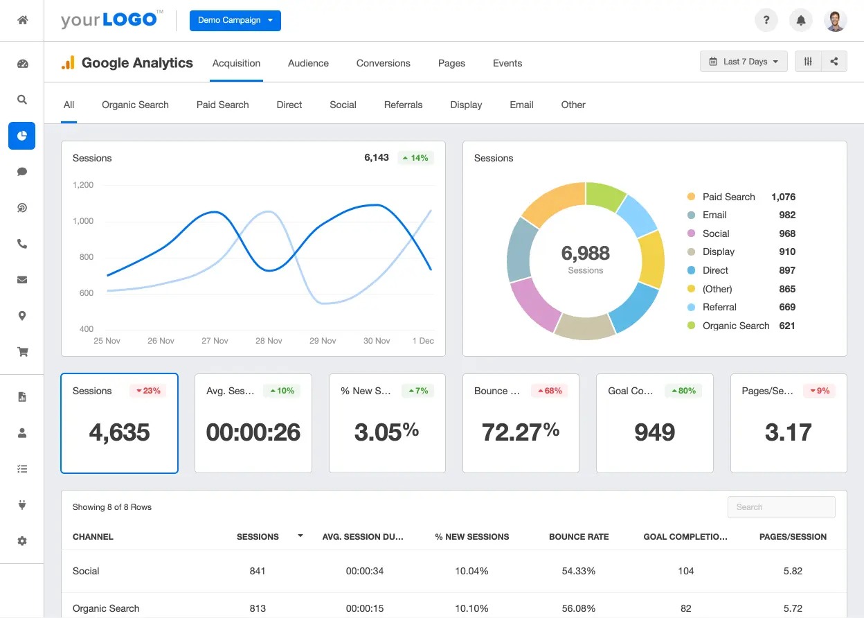
The Google Analytics Dashboard is like a summary sheet for your website’s performance. It shows how many people visited your site, where they came from (like search engines or social media), and what they did while there. Think of it as a quick overview of your website’s health!
Sales Pipeline Dashboard:
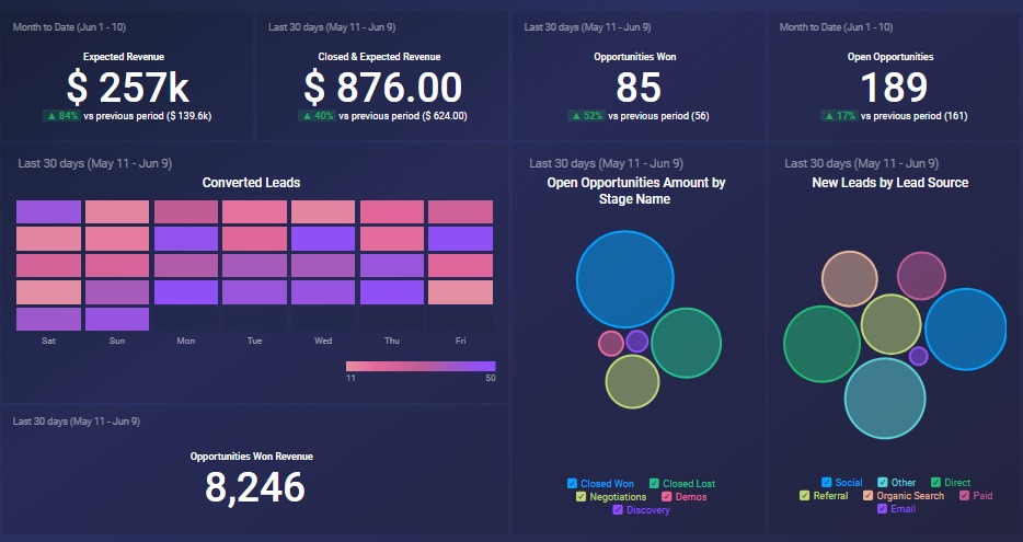
A Sales Pipeline Dashboard is like a visual roadmap for sales teams. It shows the progress of potential deals from initial contact to closing. Imagine it as a dynamic chart that helps salespeople track leads, assess their likelihood of conversion, and prioritise follow-ups.
Recruitment dashboard:
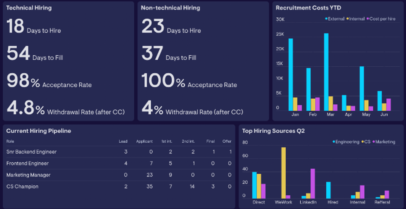
A Recruitment Dashboard provides a visual representation of data-driven metrics, key performance indicators (KPIs), and reports, allowing you to assess the performance of your recruitment funnel. It includes data on applicants, hires, campaigns, and budgets. By analysing this data together, you can gain insights into the entire recruitment process, improve candidate sourcing, reduce costs, and develop effective talent acquisition strategies for your organisation.
Email marketing dashboard:
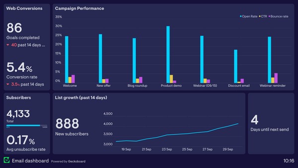
An email marketing dashboard is a tool that consolidates relevant data from various email campaigns and audiences into one place. It presents this information in an easy-to-understand format, allowing marketers to track the progress of their email marketing strategy. With an email dashboard, you can quickly assess key metrics, identify trends, and make informed decisions to optimise your email efforts. Key metrics to include in such a dashboard are conversion rate, revenue attributed to email source, average order value, email audience trend, and bounce rate. It’s like having a control centre for your email campaigns!
Dashboard Design Best Practices
- User-Centric: Understand your audience and their needs. What insights do they seek?
- KPIs and Metrics: Highlight key performance indicators (KPIs) relevant to your domain.
- Layout and Hierarchy: Organise visualisations logically. Prioritise critical information.
- Interactivity: Balance simplicity with interactive elements for deeper exploration.
Conclusion
Data visualisation and dashboards empower decision-makers, analysts, and users to extract meaningful insights. Remember, the best dashboards are both informative and delightful!
Placement of the week

Devyani Gaikwad-B Arch
Tagloy Media Pvt Ltd-UX Ui Designer
Architecture students’ strong visual understanding and software skills make UI/UX Design a perfect fit. Even as a fresher, this course opens doors to good packages. The module and Figma sessions were beneficial. Portfolio evaluations and interview preparation were top-notch. Yes, it was a great learning experience. The organized sessions and helpful LMS were appreciated. It’s a promising start for more opportunities ahead.
Accessibility Audit Tools
Responsive Design Practices
Data Visualisation and Dashboards
The bombardment of data from every direction is the norm in this social media age. Which often leaves us feeling overwhelmed and unsure of what it all means. This is where data visualisation steps in, acting as a translator, transforming raw data into clear, concise, and easily digestible insights.
Data visualisation uses graphical elements like charts, graphs, and maps to present information in a way that our brains can readily grasp. Our eyes are naturally drawn to patterns and colours, allowing us to see trends, outliers, and relationships between data points that might be missed in spreadsheets or tables.
What is a dashboard?
Taking data visualisation a step further, dashboards provide a centralised location to view a collection of these visualisations. Imagine a customisable cockpit, displaying all the key metrics and performance indicators relevant to a specific goal or process. Marketing teams might use a dashboard to track website traffic, social media engagement, and conversion rates. Sales teams could monitor leads generated, deals closed, and sales pipeline health.
Why use dashboards?
Dashboards are essential tools for businesses, providing a consolidated view of critical metrics. Here’s why they matter:
- Reduce Report-Building Time: Dashboards save time by aggregating data from various sources, eliminating the need to sift through multiple tools or spreadsheets.
- Single Source of Truth: When executed well, dashboards become the go-to source for accurate information, reducing confusion and improving decision-making.
- Set Actionable Goals: Visualising data helps set clear, achievable objectives.
- Team Accountability: Dashboards foster transparency and hold teams accountable for performance.
- Enhance Communication: Interactive visuals communicate key messages more effectively than traditional reports.
- Automate Tasks: Dashboards automate repetitive tasks, freeing up valuable time.
- Minimise Human Error: By centralising data, dashboards reduce the risk of manual mistakes.
- Analyse Data Faster: Real-time dashboards allow quick insights and informed pivots.
How to craft effective dashboards?
While data visualisation is powerful, it’s important to remember that poorly designed dashboards can be confusing or misleading. Below are the principles to be kept in mind:
- Know your audience: Tailor the dashboard content and complexity to the specific needs and technical backgrounds of the users.
- Focus on the story: What is the intended message you want to convey through the data? Ensure the visualisations all contribute to a clear narrative.
- Choose the right charts: Different chart types are better suited for different purposes. Line graphs show trends over time, while pie charts highlight proportions.
- Simplicity is key: Avoid cluttering the dashboard with too much information. Prioritise clarity and ensure the visualisations are easy to understand at a glance.
Data visualisation and dashboards are transforming the way we interact with information. By harnessing the power of visual communication, we can unlock the true potential of data, leading to better decision-making and improved outcomes across all industries.
What are some examples of dashboards?
Google Analytics:

The Google Analytics Dashboard is like a summary sheet for your website’s performance. It shows how many people visited your site, where they came from (like search engines or social media), and what they did while there. Think of it as a quick overview of your website’s health!
Sales Pipeline Dashboard:

A Sales Pipeline Dashboard is like a visual roadmap for sales teams. It shows the progress of potential deals from initial contact to closing. Imagine it as a dynamic chart that helps salespeople track leads, assess their likelihood of conversion, and prioritise follow-ups.
Recruitment dashboard:

A Recruitment Dashboard provides a visual representation of data-driven metrics, key performance indicators (KPIs), and reports, allowing you to assess the performance of your recruitment funnel. It includes data on applicants, hires, campaigns, and budgets. By analysing this data together, you can gain insights into the entire recruitment process, improve candidate sourcing, reduce costs, and develop effective talent acquisition strategies for your organisation.
Email marketing dashboard:

An email marketing dashboard is a tool that consolidates relevant data from various email campaigns and audiences into one place. It presents this information in an easy-to-understand format, allowing marketers to track the progress of their email marketing strategy. With an email dashboard, you can quickly assess key metrics, identify trends, and make informed decisions to optimise your email efforts. Key metrics to include in such a dashboard are conversion rate, revenue attributed to email source, average order value, email audience trend, and bounce rate. It’s like having a control centre for your email campaigns!
Dashboard Design Best Practices
- User-Centric: Understand your audience and their needs. What insights do they seek?
- KPIs and Metrics: Highlight key performance indicators (KPIs) relevant to your domain.
- Layout and Hierarchy: Organise visualisations logically. Prioritise critical information.
- Interactivity: Balance simplicity with interactive elements for deeper exploration.
Conclusion
Data visualisation and dashboards empower decision-makers, analysts, and users to extract meaningful insights. Remember, the best dashboards are both informative and delightful!
Accessibility Audit Tools
Responsive Design Practices
User Onboarding Flows
Information Architecture
Cross Cultural Design Consideration
Sustainable Design Principles
Placement of the week

Devyani Gaikwad - B Arch
Architecture students’ strong visual understanding and software skills make UI/UX Design a perfect fit. Even as a fresher, this course opens doors to good packages. The module and Figma sessions were beneficial. Portfolio evaluations and interview preparation were top-notch. Yes, it was a great learning experience. The organized sessions and helpful LMS were appreciated. It’s a promising start for more opportunities ahead.
